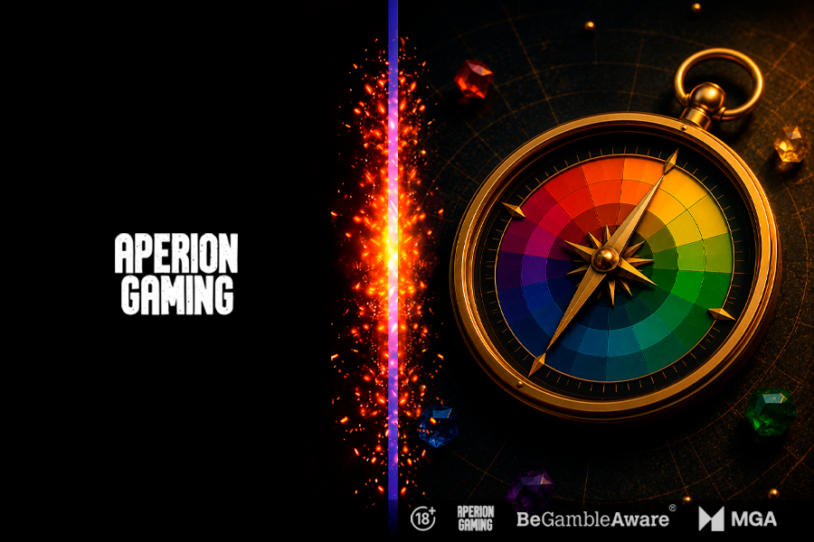
Color is the first thing a player registers when they open a game. Before the first spin, before reading a label - the palette is already communicating something. The question is whether it is saying the right thing.
A warm, high-contrast palette reads as exciting and high-energy. A cooler, lower-contrast one feels calm and trustworthy. Neither is better - but both need to match what the game actually delivers.

Gold is perhaps the clearest example. It appears in almost every high-payout slot because players instinctively associate it with reward, wealth, and celebration. When a big win fires and gold floods the screen, the color has been primed to amplify the moment.
Contrast works differently. High contrast keeps the eye moving and signals that something is always happening - right for fast, high-volatility games. Lower contrast feels more settled, better suited to longer, more comfortable sessions.
Color also helps players navigate a game without thinking. Important buttons, bonus indicators, and high-value symbols naturally attract attention when contrast is used correctly. When every element competes for attention, players spend more time interpreting the interface than enjoying the experience.

Colour is often seen as the finishing touch of game development. In reality, it influences how players perceive a game before they interact with a single mechanic. When used with intention, it strengthens usability, reinforces emotion, and helps create experiences players remember long after the session ends.
At Aperion Gaming, colour decisions are part of the concept brief, ensuring that visual design supports gameplay from the very beginning.
Send us a message.

